The SNES delivered. The crisp 16-bit graphics were a thing of beauty, and Nintendo made sure to stuff the SNES’ library full of unforgettable games like Super Mario World and TLoZ: A Link to the Past. If you’re one of the lucky gamers who were around to experience it, you’ll remember many amazing title screens that symbolize the fun you had with each of these games. Let’s look at some of the most iconic screens from this gen and see what made them stand out.
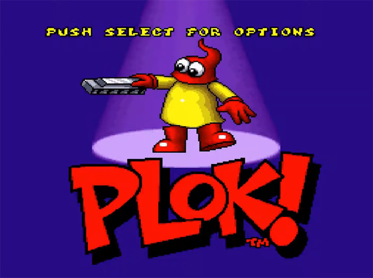
20. Plok! (1993)
Nowadays, memorable title screens must have something to set them apart, such as built-in mini-games or music so good that you’ll just leave the console running to hear it. Plok! is the latter. This side-scrolling platformer opened with the main character – the King of Akrillic Island – playing a classic-style rock and roll tune on his trusty harmonica. The music is fantastic, and the animation of this red blob playing the harmonica was surprisingly well-timed with the music in the background despite being a short loop.
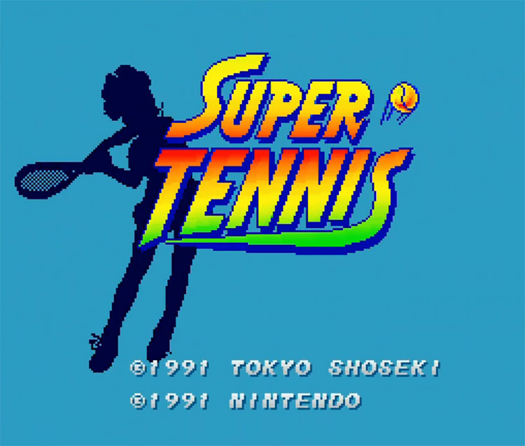
19. Super Tennis (1991)
The purpose of a title screen back in the day was to make the biggest impact on the viewer in the shortest amount of time. Super Tennis achieves this by showcasing the SNES’ 16-bit hardware. It renders a detailed image of a cute tennis player, which slides across the screen before becoming a silhouette behind the Super Tennis title. The sportsy music may have been a little bit generic, but the Super Tennis logo was bright, and the light blue color of the background was soothing.
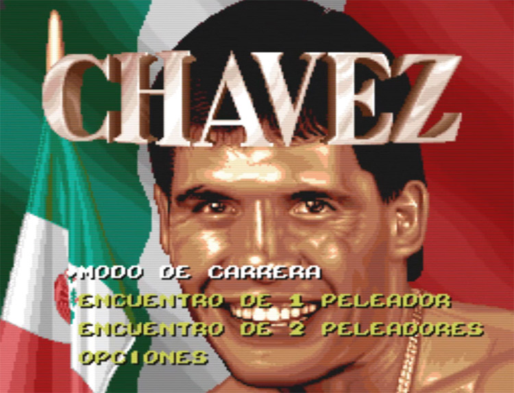
18. Chavez (1994)
Some of you might remember the boxing simulator hit Riddick Bowe Boxing – but only a few have ever seen Chavez in stores. Chavez is a re-imagining of Riddick Bowe Boxing that replaces the titular Riddick with Mexican professional boxer Julio César Chávez. Malibu Interactive created this version to sell in Mexico and the American Southwest, where Chávez was a major star. I love this title screen for its absolute lack of subtlety. The title screen features the Mexican flag twice! Plus, Chávez’s zoomed-in face looks oddly comical. I’m having trouble figuring out whether this is an example of early Latino representation or just a bit racist. It’s really a product of its time, and I love that.
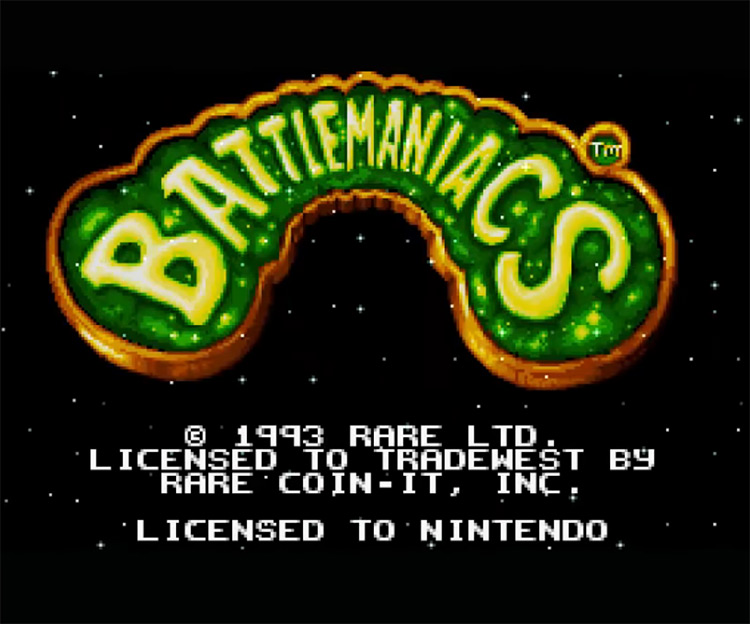
17. Battlemaniacs (1993)
Battletoads Rash and Pimple are some of the most famous and beloved characters from the 16-bit era. Developed by Rare, Battletoads in Battlemaniacs gave fans more of the hard and punishing platformer beat-em-up gameplay they loved. This was like Dark Souls back in the day! The title screen itself is simple but memorable. The neon-bright green color of the Battlemaniacs logo pops out thanks to the black background, and the stars behind it promise a grand adventure of galactic proportions. The hype-inducing music playing in the background is one of the best parts – and probably what fans remember the best. If that doesn’t get you pumped for some Battletoading, nothing will.
16. Pilotwings (1991)
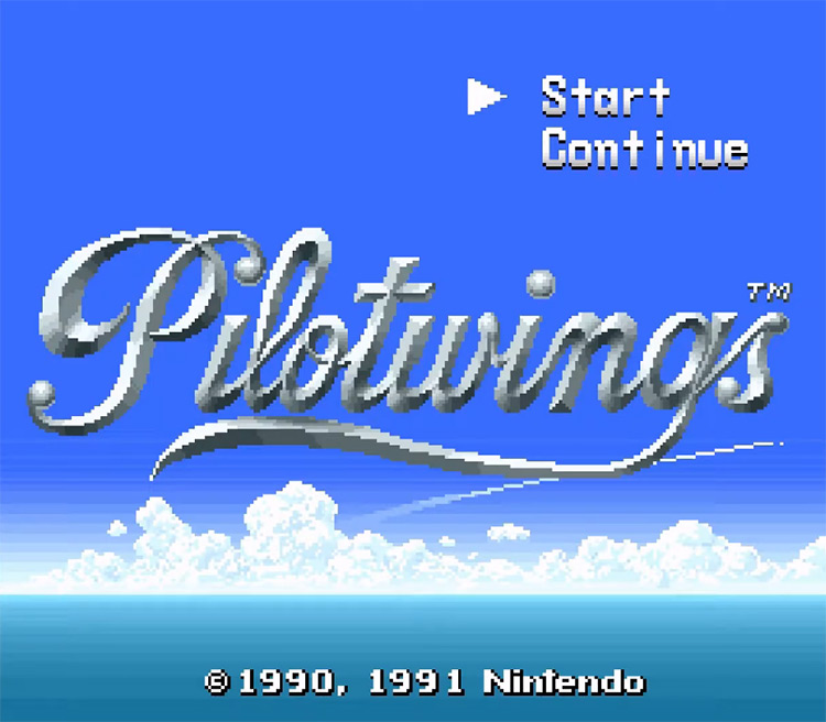
Pilotwings was one of the SNES’ first titles and is still remembered as one of the best. The game is about flying challenges, so the title screen features a bright blue sky over a darker sea with gorgeous clouds above the horizon. It’s something you’d generally only see if you were flying over the ocean water body. The game was renowned for its graphics at the time of release, and the title screen gives you a taste. One thing Nintendo could have done better on this one is the typography, which strikes me as a little bit generic, though the silver color is a nice touch.
15. Terranigma (PAL) (1996)
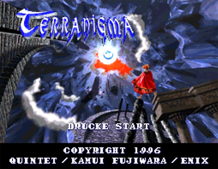
Many American readers might not recognize Terranigma – an incredible top-down RPG that never made it to the US. Developed by Quintet, this game tells the story of Earth’s rebirth by the hand of the heroic main character. He’s the one standing atop some pillars on the title screen like a badass. Though the font chosen for the Terranigma logo is pretty terrible, everything else about this title screen screams “epic.” The short intro that plays as the title screen loads makes it even more memorable. It begins with a pocket watch, which morphs into an image of the Earth as seen from space, and later into the Terranigma logo. It’s compelling imagery that evokes the idea of time and space, which are crucial to the game’s plot.
14. F-Zero (1991)
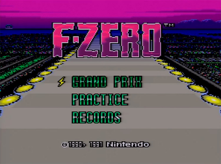
F-Zero was a landmark in the history of racing games thanks to the SNES’ Mode 7 scrolling feature, which allows developers to create pseudo-3D gaming environments. Thanks to the bright and unusual colors, the title screen is highly memorable. I don’t know if you’ve noticed, but the sky in real life isn’t purple! That said, neither are hovering racing karts. The magenta F-Zero logo and green menu text are bright and contrasting. Play this at night, and they’ll probably be burned into your retinas.
13. The Lost Vikings (1993)
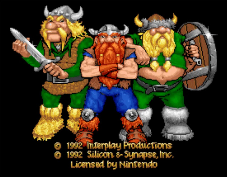
When you hear the word “Viking,” you might think of a sexy Norseman built like a bodybuilder who’s come to give you some ‘shrooms and talk about gender equality – but it wasn’t always this way. The Lost Vikings’ title screen presents a more traditional image: three buff strongmen whose big biceps are only second to their bulbous noses and prodigious facial hair. Silicone & Synapse did a fantastic job crafting a title screen that’d sell you Erik the Swift, Baelog the Fierce, and Olaf the Stout as absolute badasses of a bygone era. The way the logo falls down from above like it weighs 500kg adds further to the idea of an epic, manly game.
12. Mortal Kombat II (1993)
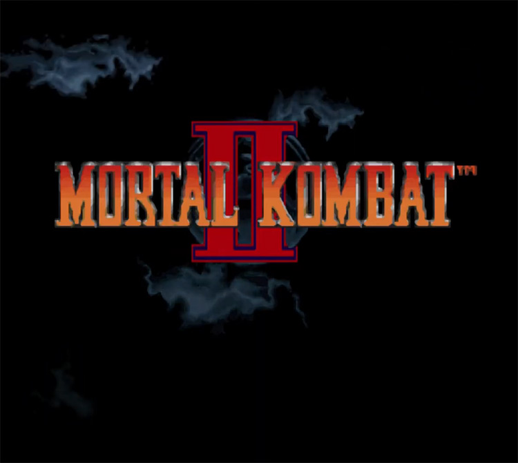
Mortal Kombat was and continues to be one of the most influential fighting game franchises ever created. The first sequel – Mortal Kombat II – was even more successful than the original, and looking at its title screen, you have to ask yourself whether they knew what was coming. Instead of showcasing the dragon logo front and center, they only showed glimpses of it as sporadic thunder illuminated it from different angles, teasing the epicness to come. They’re saying, “we know you’ve been waiting for this, so we don’t even have to catch your attention.” It’s intriguing and ominous, and you won’t easily forget it.
11. Mega Man X (1994)
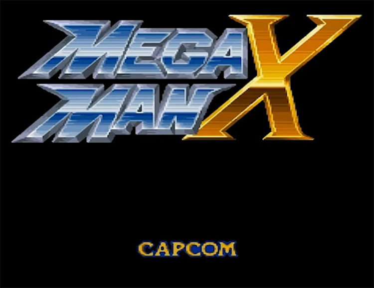
For their first foray into the 16-bit realm, the Capcom team behind Mega Man decided to give the blue bomber an extreme makeover – and add a big X to the game’s name, so people knew it was next-gen. While simple, the title screen for the first Mega Man X game on the SNES is undeniably iconic. The background music is cool and exciting, and the logo is unforgettable – especially the X. It might sound silly nowadays, but it was the perfect way to signal to people that this wasn’t the same old Mega Man they’d gotten used to in the 8-bit era.
10. Super Street Fighter 2: The New Challengers (1994)
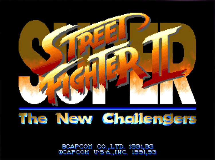
Street Fighter is one of the few fighting games that could dare to compare itself with Mortal Kombat – and when it comes to SNES title screens, they actually come out on top. SSF2: The New Challengers opens with a high-detail render of Ryu preparing himself to shoot a Hadouken. After the blast of the energy beam dissipates, you’re treated to the actual title screen, displaying Street Fighter’s iconic logo – which was already very well-known. The detail on Ryu’s muscles is impressive, and the pure, unadulterated hype this scene generates is off the charts.
9. Super Mario Kart (1992)
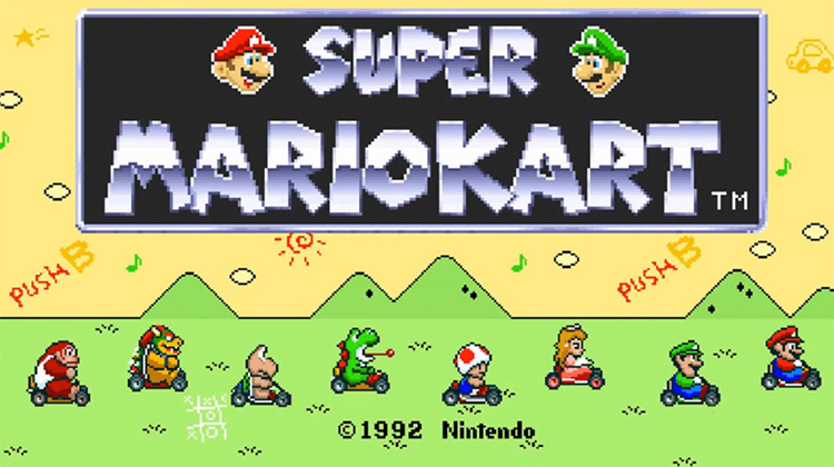
Mario Kart has a history of fantastic title screens dating back to the SNES days. Nintendo loves to set itself apart from the competition and show off its games with fun, animated title screens. In this case, it’s done by showing the racers blaze across the screen. This allows you to marvel at the 16-bit detail of the sprites and shows off some of the game’s gameplay elements, like hitting others with Koopa shells or leaving banana peels for them to slip on.
8. StarFox (1993)
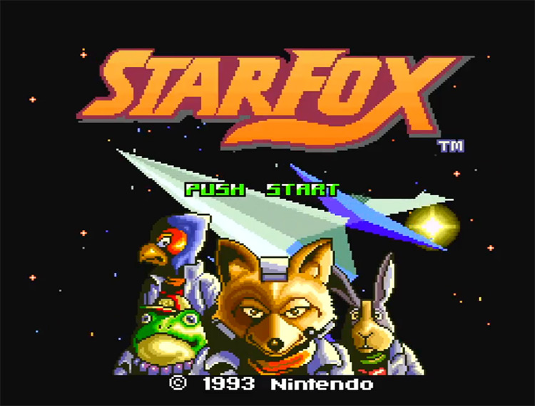
Nintendo wouldn’t release a fully 3D console until the Nintendo 64 – but that doesn’t mean they didn’t have 3D elements in their games. StarFox shows off its 3D graphics with a slowly spinning 3D Arwing over a starry background. This was revolutionary for SNES gamers at the time. This, along with the epic soundtrack and iconic logo, made this title screen unforgettable.
7. SimCity (1991)
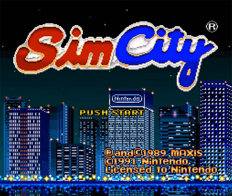
The original SimCity was pretty similar to its modern counterparts: you build a city, zone its districts, lay down some roads, and pray to the gods of RNG that disaster doesn’t destroy it all in seconds. Its title screen teases the upcoming urban-designing adventure by showing you the animated skyline of the city. As the highly detailed buildings roll across the screen, you can make out the highway’s lights, their reflection on the waters below, and even a couple billboards promoting developer Maxis and Nintendo.
6. Secret of Mana (JP) (1993)
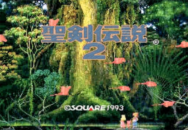
Many of you fondly remember the fantastic SNES title screen for Secret of Mana – but did you know there’s an even better version in the original Japanese release? Known in Japan as Seiken Densetsu 2, the game’s Japanese title screen is almost exactly the same as the international version. It’s a shot of the game’s protagonists marveling at the beauty of the Mana Tree as some flamingos fly across the screen. The main difference is that, in the Japanese version, you see a detailed depiction of the whole Mana Tree, while the international release zooms into the roots. Naturally, the high-resolution version of the tree dramatically embellishes the title screen. Coupled with the fantastic music, it’s the perfect introduction to an epic fantasy adventure.
5. The Legend of Zelda: A Link to the Past (1992)
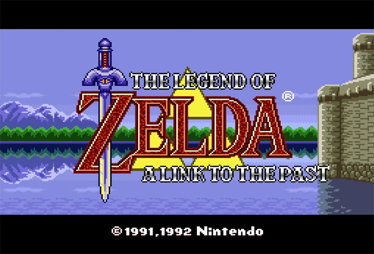
Few games elicit as much excitement and nostalgia as The Legend of Zelda: A Link to the Past – and the title screen definitely contributes to the emotional response. It opens with a pseudo-3D animation of the three pieces of the Triforce coming together before revealing a beautiful Hylian landscape and the game’s logo. This was the first game featuring the legendary Master Sword, and Nintendo made sure to include it on the title screen. It falls from the heavens and becomes entangled with the “Z,” completing the game’s iconic logo.
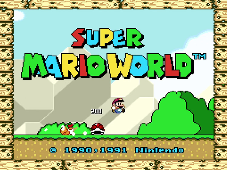
4. Super Mario World – 1991
The title screen for Mario’s first 16-bit adventure is just perfect. The music, the bright colors, and the detailed graphics were stunning at the time. Everything about it screams “fun” and “excitement.” Nintendo also did a great job of showcasing the gameplay on the title screen. We get to watch Mario ride Yoshi, eat some power-ups, and even pull a pro-gamer move on some unsuspecting Koopas.
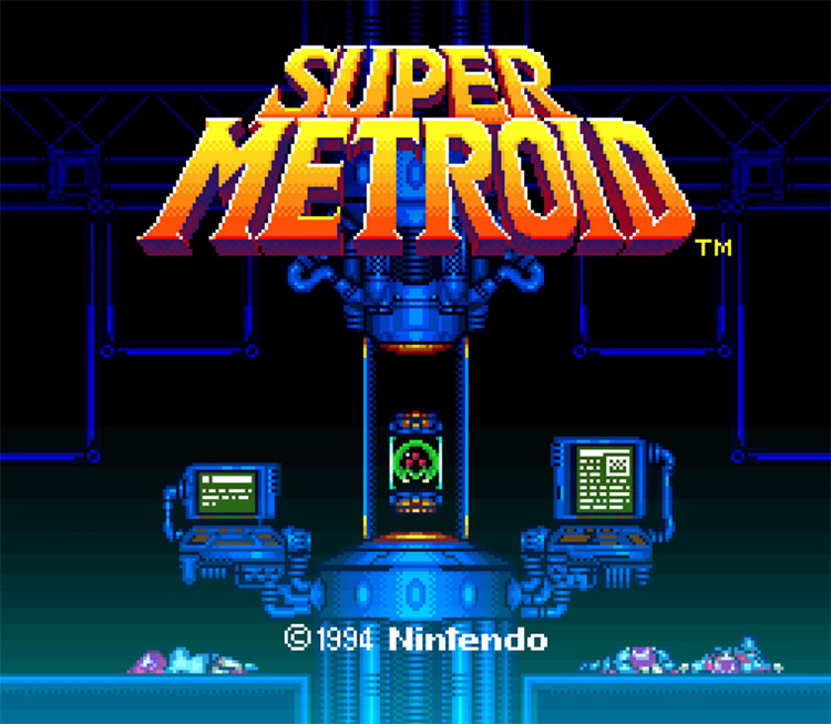
3. Super Metroid (1994)
Metroid has always been one of Nintendo’s darker series, but the opening to Super Metroid takes the cake for the most disturbing. This title screen tells you everything you need to know about the plot: there’s a Metroid alive somewhere, and many people are dying around it. The scene is very similar to a temple. Its layout leads your eyes toward the center, where the Metroid floats ominously before the bright Super Metroid logo catches your eye. It was shocking to see actual corpses and gore on a Nintendo game – even if it was only 16-bit. It makes this title screen unique among Nintendo products, and it definitely got people excited to play this new “serious business” adventure back in the day.
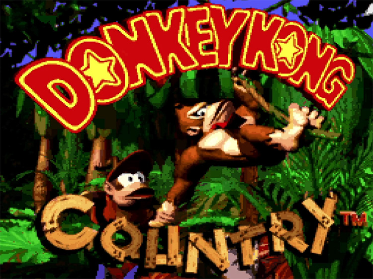
2. Donkey Kong Country (1994)
Few games in the industry’s history have caused the level of visual impact as the original Donkey Kong Country. Nintendo used a series of pre-rendered sprites based on 3D models to create the graphics for DKC. The result is a pseudo-3D game with an incredibly distinctive style that felt genuinely innovative. DKC further establishes itself as the “new big thing” through its opening cinematic, which portrays Donkey Kong as a modern, “hip” character who listens to hip-hop on a boombox in contrast to Cranky Kong’s record-player. And those dance moves? DK invented TikTok dancing before social media was even a thing.
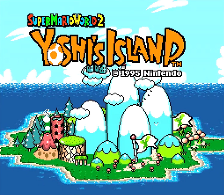
1. Super Mario World 2: Yoshi’s Island (1995)
When Yoshi’s Island was released in 1995, Nintendo was getting ready to release their revolutionary Nintendo 64, so 3D gaming was all they had in mind. Thanks to a 2nd generation SuperFX chip on the cartridge, they could bring some of this 3D magic to SMW2 – showcased beautifully on the title screen. It shows you a complete model of the titular island, spinning around slowly and revealing the different landscapes and locations you’d be visiting as you attempt to help Baby Mario rescue his lil’ bro. Instead of blasting exciting music, Nintendo chose to play peaceful island sounds, like seagulls and waves hitting the shore. This screen was immersive in a time when immersion wasn’t the biggest concern.
