Even when there are Pokémon that seem weird or useless, I like to see the bright side of their design. Yes, Stunfisk is weird, but it’s kind of charming in its own derpy way! But with almost 900 Pokémon, there have to be some stinkers. And I found this especially true with the shiny Pokémon designs. Because I have written over a dozen shiny Pokémon listicles, and after looking at all of them several times, I’ve found some that I think should be sitting at the bottom of the barrel. And here they are!
20. Tranquill
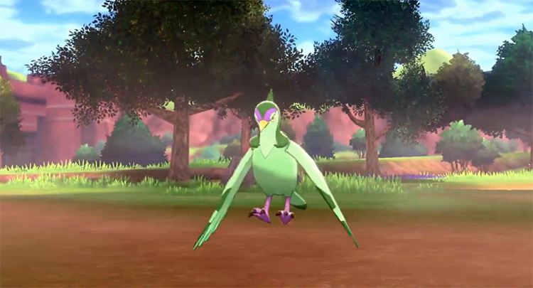
You know what everyone likes? The Incredible Hulk. That bright green skin and those bright purple pants? He looks awesome! And you know what that would really look great on? A bird. Enter Tranquill. For some reason, the designers over at Game Freak just decided to dye all of Tranquill’s feathers bright green and make its legs purple. It just looks like someone used the paint bucket option in MS Paint. However, it’s so ridiculous that it may get into “so bad it’s good” territory. Let’s move on before that happens…
19. Mamoswine
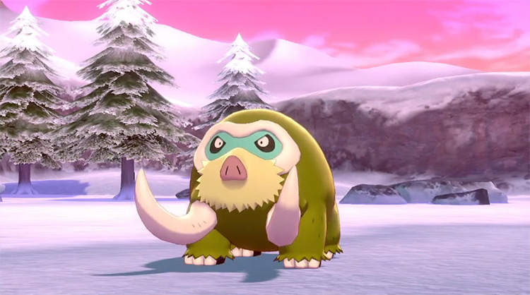
In my research for the various shiny articles I’ve written, I’ve fallen in love with shiny Piloswine. Those golden locks really make the swine Pokémon stand out! It’s just a shame that Mamoswine doesn’t get the same treatment. Mamoswine essentially gets its brown fur turned into pea soup. It’s a gross greenish yellow that makes me sad to see this Pokémon. And Mamoswine is one of my favorites to use, too! This is truly an awful shiny that takes a great Pokémon and makes it completely undesirable.
18. Burmy/Wormadam (Also Zekrom, Garchomp, and any other Pokémon that barely changes)
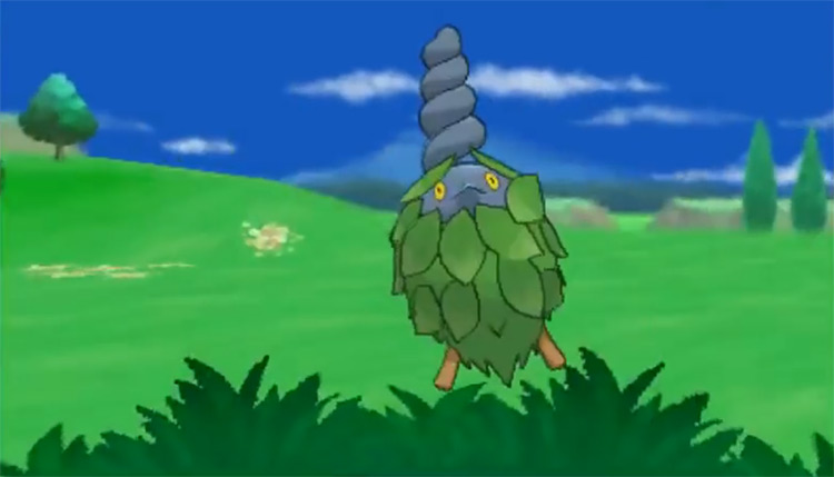
Look at regular Wormadam. Look at shiny Wormadam. Can you notice any difference? Because I can’t. Wormadam and shiny Wormadam look exactly the same to me – and this is true with a ton of different Pokémon. Burmy. Zekrom. Garchomp. Togekiss. All of these Pokémon’s shiny forms look exactly the same as the original. And that’s just disappointing. So while I just have Wormadam on here, it’s really a representation of all of these unchanged shiny Pokémon. Then why did I choose Wormadam? Because I hate it.
17. Shiinotic
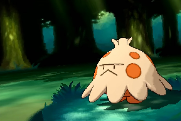
Mushrooms are a peculiar thing. Often beautiful and delicious, there are some mushrooms that actually grow out of poop. While that is interesting, I don’t want to be reminded of that when I look at one. This is why I don’t like shiny Shiinotic. Shiny Shiinotic, with its brown base and brown edges, looks like it was growing out of poop and still has some left on it. This is not helped by the purple top being changed into a bright yellow, almost like urine. I mean, this is truly a disgusting choice that makes the previously cute Pokémon look disgusting. Warning: if this discussion of bodily functions disgusts you, you will not like the rest of this list.
16. Maractus
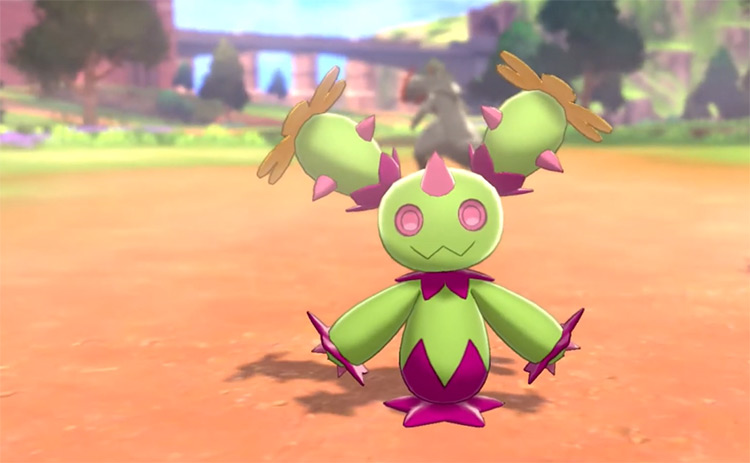
Normally, I like when a forgotten Pokémon gets a crazy and loud shiny form. Just look at Bruxish! However, there is an exception to every rule – and for me that has to go to Maractus. Maractus is a Pokémon that was never truly effective in battle, and never cute enough to garner a lot of attention. It just looks like a cactus with a face on it (which we already have). Unfortunately, the shiny form does not help in making Maractus more memorable. The dark green and yellow highlights are changed to a maroon color, and the pink flowers are changed to orange. All of the green is left unchanged. This makes Maractus look even more lifeless than before, which is a real shame. I just don’t want to look at it. Maractus is a forgotten Pokémon – and its shiny form also deserves to be forgotten.
15. Kubfu
As I’ve made known in my alternate starters article, I love Kubfu. It’s super adorable. And the way it evolves is unique and fun! If only its shiny form was more interesting… As a shiny, Kubfu’s tiny yellow mouth is changed to orange. That’s it. There is no other change made to this Pokémon’s design. Which is a real shame! Imagine how cool it would be if its fur was changed to black or white, or literally anything else. The only reason the Urshifu forms aren’t on here is because their claws also change from yellow to orange. Either way, both forms deserve better.
14. Uxie
Since they’re grouped together, the lake trio of Uxie, Mesprit, and Azelf have a common theme between them: Their light blue bodies are changed to yellow while their different head colors are made darker. This creates an interesting effect with Mesprit and Azelf, but makes Uxie look really bad. This is because Uxie’s head was already the exact same yellow. So they made its head slightly more orange. And this combo doesn’t work at all. Neither color is different enough to compliment or clash with the other. Instead we get this kind of amorphous combination of yellow and yellow-orange. Maybe a different color should have been chosen instead of yellow. Or maybe Uxie’s head should have been made lighter instead. But since neither of those happened, we’re left with a gross looking shiny Pokémon.
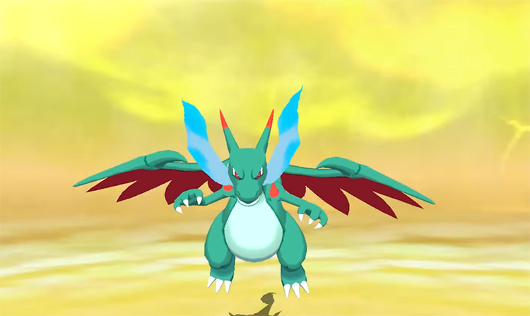
13. Mega Charizard X
Charizard is famous for having one of the coolest shiny forms ever. Black on red is a great color combo that has worked for centuries. And Mega CHarizard Y gets the same awesome combination! But on the other side of that mega evolution coin, Mega Charizard X gets the raw end of the deal. This is partially because its skin was already changed to black. And it looks great with those blue flames! So in its shiny form, Game Freak gave Mega Charizard X dark turquoise skin and red under the wings without changing any of the flames. And this just doesn’t work. It’s kind of the same effect that happened with Uxie. The colors are too similar, and the red doesn’t help with the other colors at all. Which is a shame because the base design is really cool.
12. Lumineon
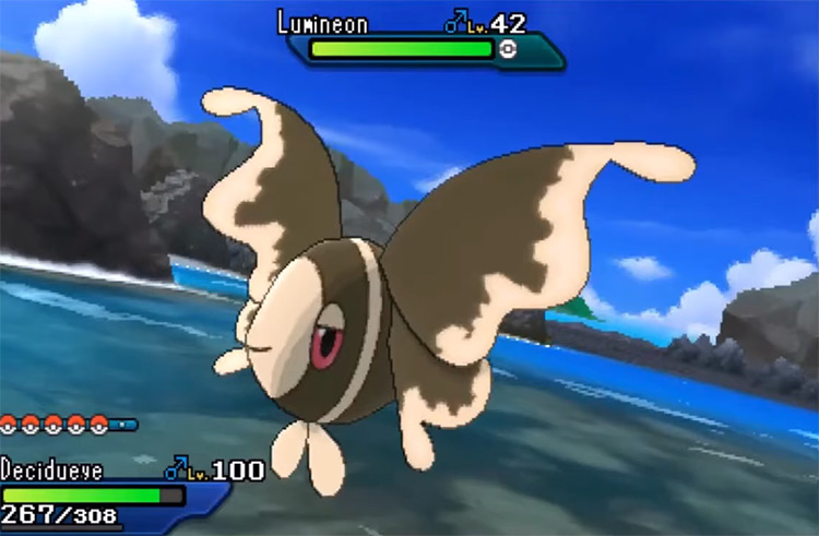
Lumineon doesn’t have a lot going for it. It’s really weak and surrounded by a lot of stronger Water-type Pokémon. It’s a good thing that it has a beautiful design with a nice blue coloring! So why not make it brown? This may make sense, since Lumineon often hides in the sand, but it makes the Pokémon even more forgettable than before. When it’s blue, Lumineon looks like a majestic creature in the ocean. When it’s brown, it looks like something you accidentally stepped on in the soot of a lake. A massive downgrade.
11. Hitmontop
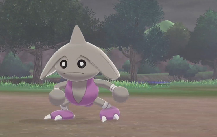
Hitmontop is a neat Pokémon that’s constantly moving because it’s loosely based on the martial art capoeira. And with its ability to spin like a top, it’s easy to get a lot of joy from this little guy! Just a shame that the shiny form completely takes this joy away. Making Hitmontop’s skin go completely gray gives it a weird Frankenstein’s monster feel. Like it’s an old body that was brought back to life with electricity. It’s capoeira-esque movements suddenly make it seem like it’s just flailing about, maybe because it doesn’t yet fully understand how to make its limbs work. And this isn’t helped by those little black eyes. Really, this shiny makes Hitmontop a lot more morbid than it was before. I wish the designers did what they did to Hitmonchan and Hitmonlee and just made the skin green. Combine that with the purple bodysuit and we’d have another Hulk on our hands!
10. Gengar
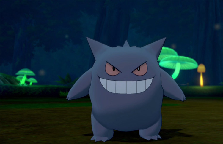
I already gave up a whole spot to Pokémon who look exactly the same in their shiny form… but I had to include Gengar on this list. Because even though it received the same edits as those previous Pokémon, it somehow ended up worse. One of the things that makes Gengar so cool is its unique bright purple coloring. In the shiny form, this is dulled down and makes Gengar just look generically dark. It’s incredibly boring for a Pokémon that’s as cool as Gengar – especially compared to its other shiny forms! Both Mega Gengar and Gigantamax Gengar become white with creepy dark eyes. These are both really cool and give a whole new feeling to the design. Unfortunately, regular shiny Gengar never reaches these awesome highs.
9. Shroomish
I like the Shroomish line. They’re great Grass-types, and Breloom really packs a punch (pun intended). And while I like the red and yellow coloring on Breloom, it does not work at all on Shroomish. It’s dome-like shape and yellow coloring really makes Shroomish look like the top of an old man’s bald head. And the green dots changing to red don’t help either. Now they look just like liver spots. So instead of an adorably grumpy mushroom, I’m looking at an old man with liver spots. And I don’t want that on my team.
8. Calyrex Shadow Rider
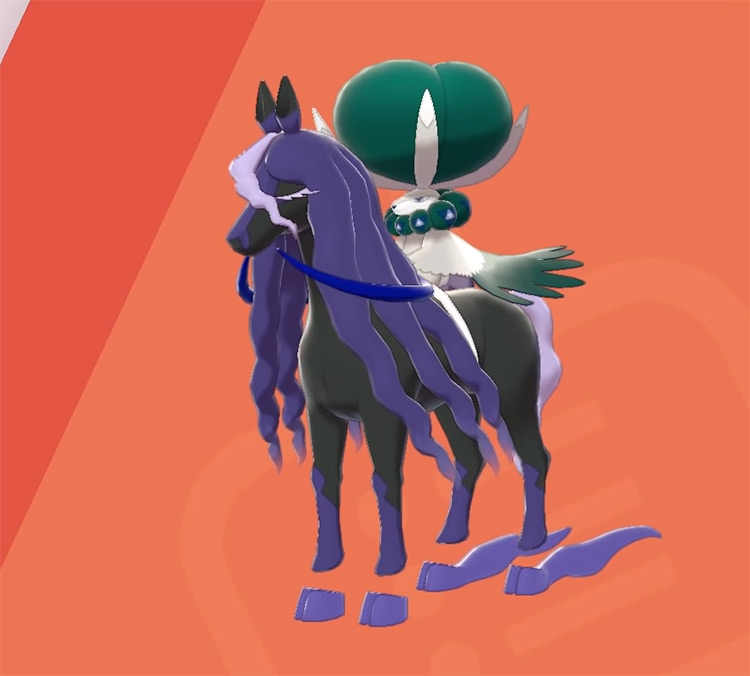
Calyrex is another Pokémon that really doesn’t change that much in its shiny form. It just becomes slightly more tan. This isn’t really that awful… but its Shadow Rider shiny actually makes me mad. This is because it takes another Pokémon with an awesome shiny down with it. Spectrier has a cool shiny form, changing its purple accents to maroon. This is awesome, especially with its spooky design. But when combined with Calyrex to form Calyrex Shadow Rider – it still remains purple. Even if Spectrier were shiny to begin with, it would still just be purple. That stinks! At least let Calyrex ride on a cool maroon horse. Instead Calyrex has to bring Spectrier down to equal its mediocrity.
7. Lickilicky
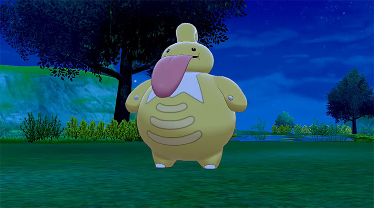
I have made it well known in my previous lists how much I dislike Lickilicky. It’s a gross Pokémon that, in my opinion, does not need to exist. If I could trade this for a Jynx evolution then I would in a heartbeat. Normally, this is when the shiny form would come in to save the day and make the Pokémon look better. Maybe the Pokémon will even be all gold to improve its quality… Well, Lickilicky’s shiny form is all gold. And it is awful. Somehow this shiny makes Lickilicky’s gross tongue stick out even more. And I do not want to look at it. In fact, I think I’ve said enough about this disgusting pustule.
6. Cyndaquil/Qwilava/Typhlosion
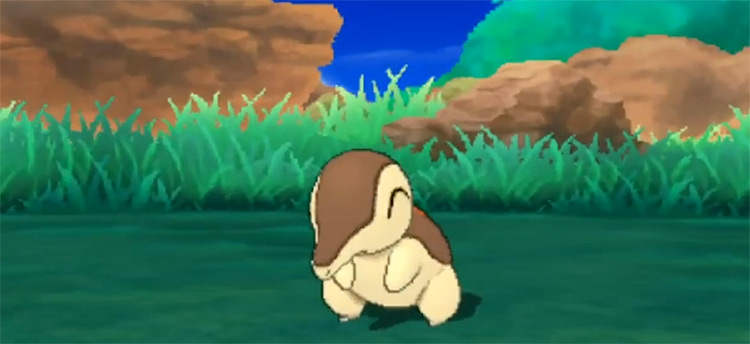
Let’s get back to some Pokémon I like! The Cyndaquil line is easily the best starter option in Johto. Heck, they may even be some of the strongest Fire-types in those games! Unfortunately their shiny forms really bring them down. The Cyndaquil line first received a major blow when their 3D sprites had the flame burst coming out of them only exist sometimes. This made them look really boring and generic. And this looked even worse for their shinies, where their black fur was changed to brown. Now Cyndaquil, Qwilava, and Typhlosion all have a long brown streak going down their back – almost like they’re track marks in someone’s underwear. Yes, I know that’s gross. But I can’t look at these Pokémon without seeing it – and now neither can you.
5. Chansey
One of the cool things that can happen with a Pokémon’s shiny form is it can give the opposite effect of what the Pokémon’s design usually exudes. While this works great for creatures like Sableye or Golisopod, it does not work for Chansey. Chansey is all about healing. That’s why it’s often seen in Pokémon Centers. This is aided by its pink and white coloring. On the other hand, its shiny form looks diseased, using pale yellow combined with green. Not only is it a bad color combo, but it destroys everything that the Chansey design worked for. If I was injured and I saw a shiny Chansey coming towards me, I would run right out of the hospital.
4. Swirlix
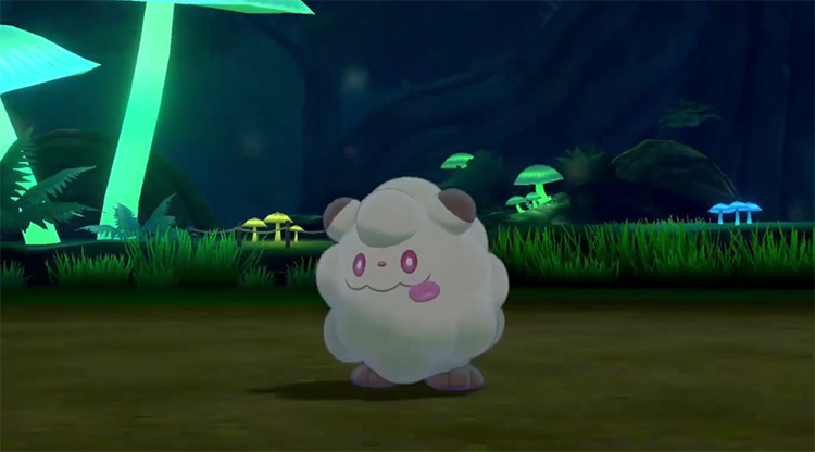
I’m just going to cut to the chase on this one: Swirlix is a fart cloud. “Come on, you’re being too harsh!” No, I’m not. That’s a fart cloud. “It’s supposed to be based on cotton candy. Maybe it’s chocolate flavored?” If by chocolate you mean doody, then yes. Yes it is. “You’re just being gross.” Probably, but I can’t help it. I call ‘em like I see ‘em. And that is 100% a cloud of fart.
3. Victreebel
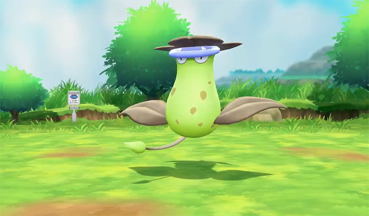
A lot of people think Victreebel is a gross Pokémon, but I disagree. It absolutely looks like what it’s supposed to be: a combination of a venus flytrap and a pitcher plant. Also, it’s one of the rare Pokémon that makes the combo of yellow and green really work. And that’s why I don’t like its shiny form. Its yellow body turns green while its green leaves turn… gray? Why gray? That just makes Victreebel look like it’s dying. But what really gets me are those blue lips. Why change the lips to blue? Is Victreebel cold? Did it get a hold of a popsicle for too long? Originally, Victreebel looked bright and dangerous. Now? It looks like its moments away from death.
2. Bergmite
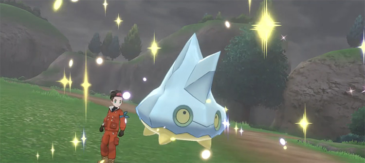
There’s an old saying for kids who go out when it’s snowing. “Watch out where the huskies go and do not eat the yellow snow.” This means that if you see yellow snow, don’t eat it, because it’s probably dog pee. So why on earth would you make a Pokémon based on snow and ice yellow? All I can see when I look at shiny Bergmite is “That’s a tiny iceberg that formed on snow that has been peed on.” It doesn’t help that Bergmite’s design is already pretty ugly, with those wide eyes and that oddly shaped head. Now whenever I see this shiny form, I’ll always feel like I knew where those huskies went.
1. Whimsicott
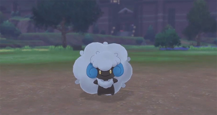
There has been a theory for a while now that Whimsicott is a racist Pokémon. People claim that it’s based on slavery because it’s a cotton Pokémon and its body is mainly brown. Frankly, I disagree with this. It’s brown because the stems of a cotton plant are brown. There’s nothing inherently racist about that. Then I saw its shiny form. In its shiny, the cotton on Whimsicott is made even whiter, while the body is flat out made to be black. And I can’t think about anything else. They already had a cute shiny form with Cottonee, the pre evolution. Why not change the color in the same way that you did there? Make Whimsicott green, or change the yellow cotton with the brown body. Either of these would have been way better. Am I reading too much into this? Maybe. Can I unsee it? Nope. And for that, I feel like Whimsicott has to be the worst shiny Pokémon out there.
